Azion Brand System
Figma, Brand Strategy, Component Libraries, Visual Identity, Voice & Tone Design, Illustration System, Iconography
An illustration system for a company that sells infrastructure, so a very technical brand could explain itself with more warmth and less weight.
Challenge
Azion sells something hard to picture: servers spread around the world that run other companies' applications. The way it talked was heavy with technical terms, and each team drew and explained the product its own way.
Solution
Caio led an illustration system with shared rules for characters, light and shape. Marketing, sales and internal teams could now explain the same idea the same way, in a tone that felt human.






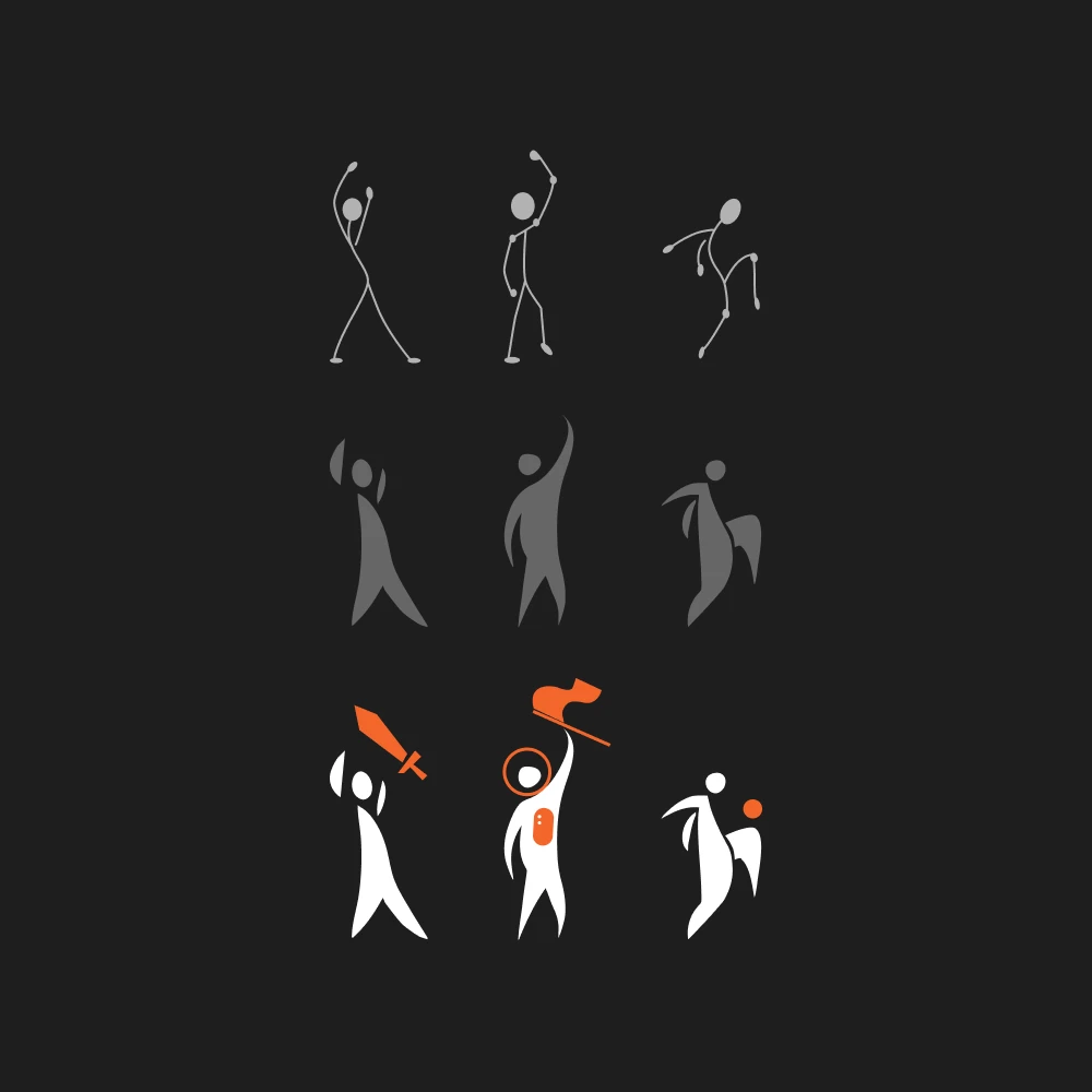
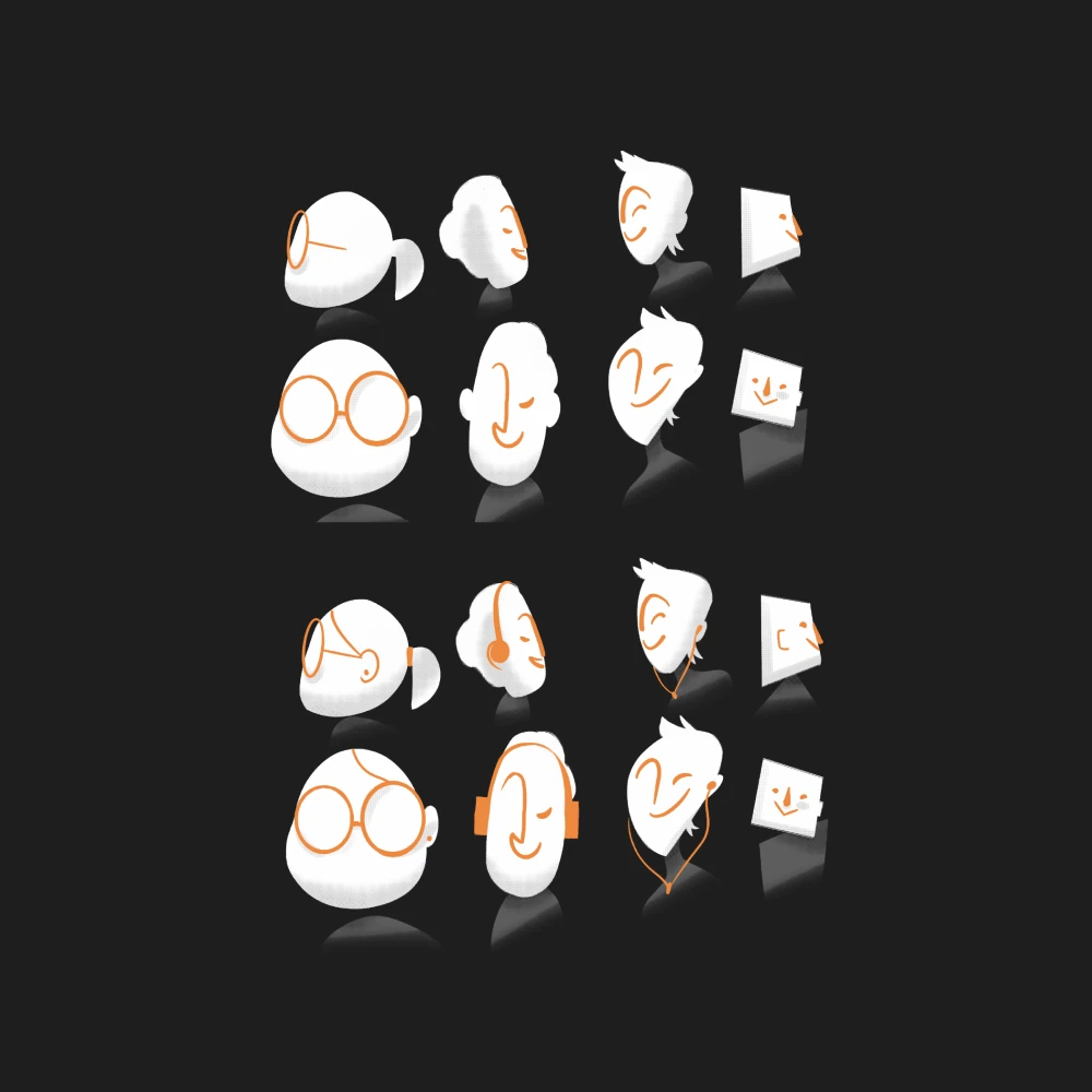
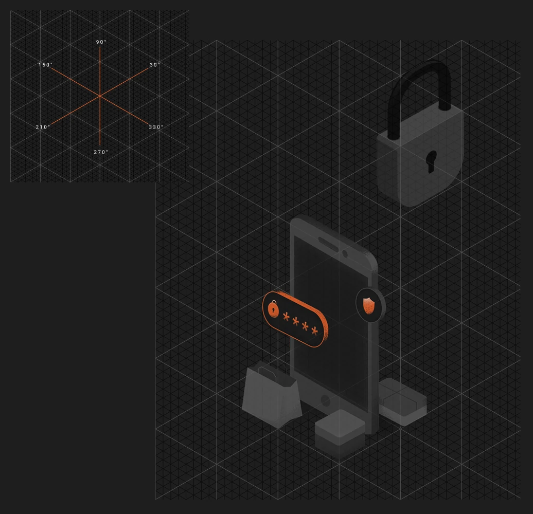

An identity for the thing nobody sees: infrastructure. The illustrations took off some of the technical weight, so people understood the idea before they read the details.

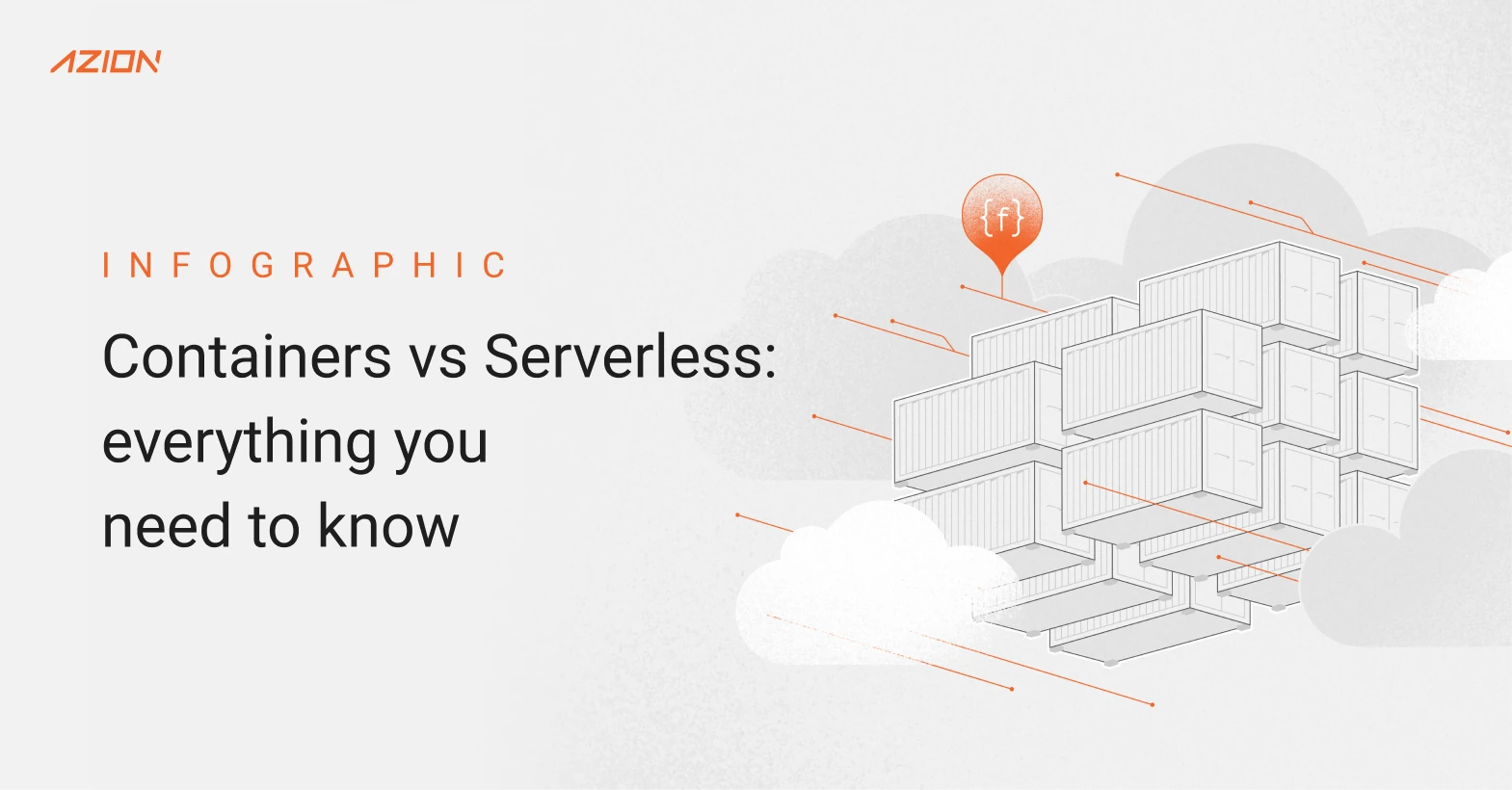

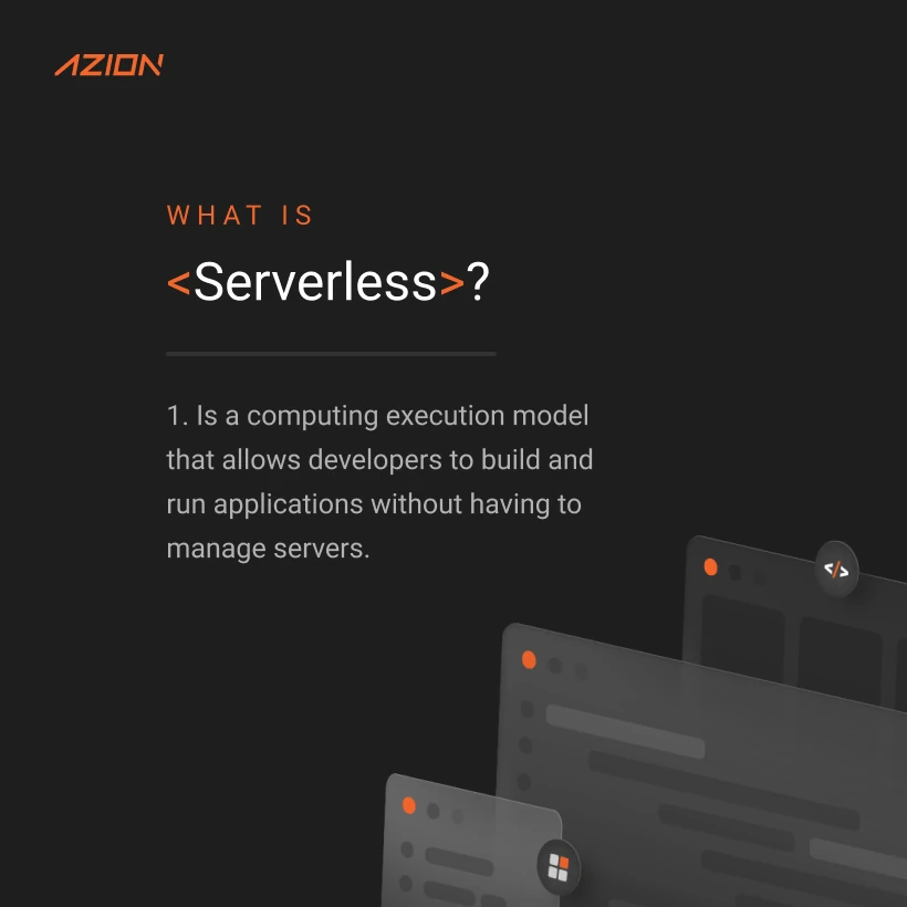
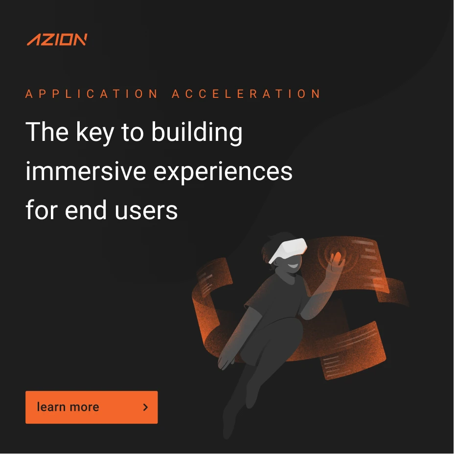



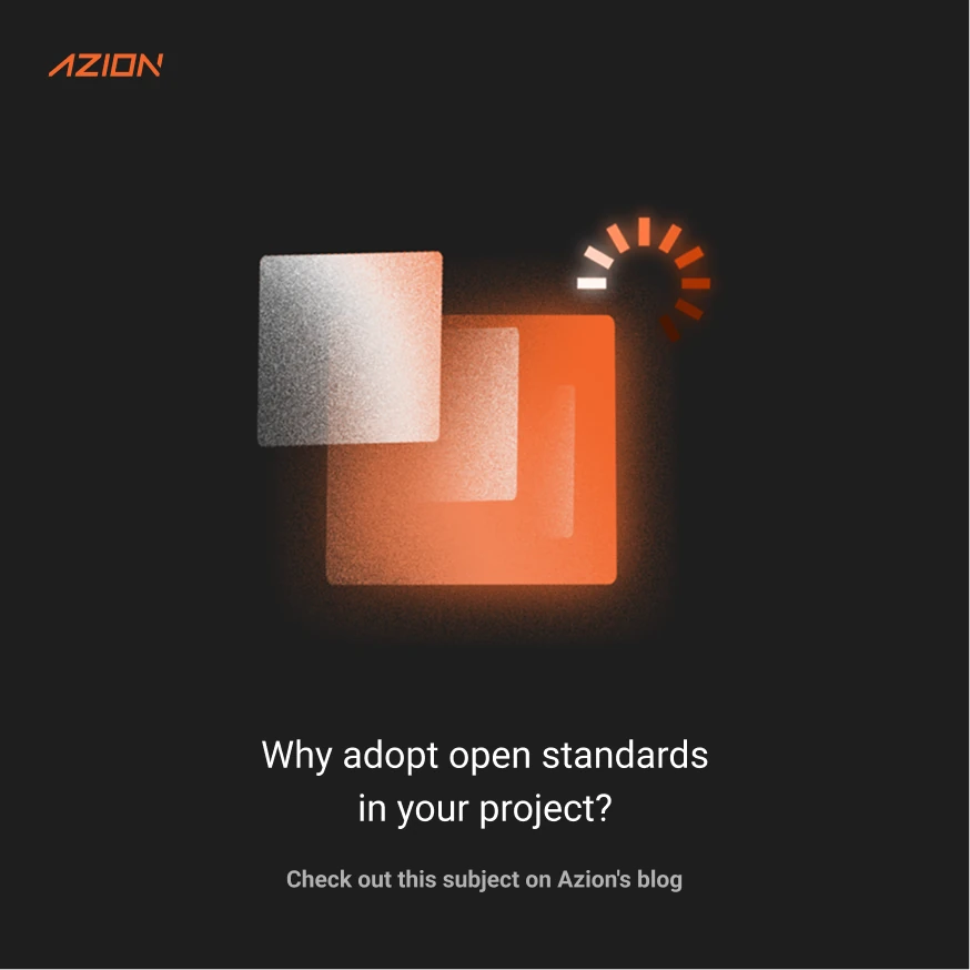
Illustration System
Characters, cubes of orange light and simple shapes that turn a technical idea into a picture any team can reuse.
Knowledge Base
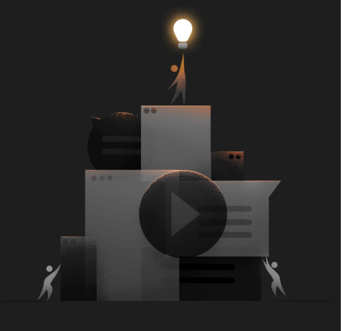
Internal training and documentation drawn in the same language. This is where the illustrations were used the most.
Project
Azion Brand System
Client & Role
Design Director, Brand Experience
Year
2021-22
Technologies
Figma, Brand Strategy, Component Libraries, Visual Identity, Voice & Tone Design, Illustration System, Iconography
Credits